How to Make an Animated Search Bar with using only HTML and CSS
Create a simple and satisfying animated search bar using HTML/CSS


Intro
In this article, as you've probably read in the title, I will show you how to create an animated search bar using HTML and CSS.
Note: This requires a basic understanding of both HTML and CSS.
Code
Basic layout
First we need to layout the basic elements for our project. I like using the HTML5 Boilerplate extension for this, the extension can be installed in the VSCode extension store. If you prefer doing everything manually then do that instead.
<!DOCTYPE html>
<html lang="en">

<head>
    <meta charset="UTF-8">
    <meta http-equiv="X-UA-Compatible" content="IE=edge">
    <meta name="viewport" content="width=device-width, initial-scale=1.0">
    <title>Animated search bar demo</title>
    <link rel="stylesheet" href="index.css">
</head>

<body>

</body>
</html>
As you can see I also linked a css file which we will need later, and added a title.
Input element
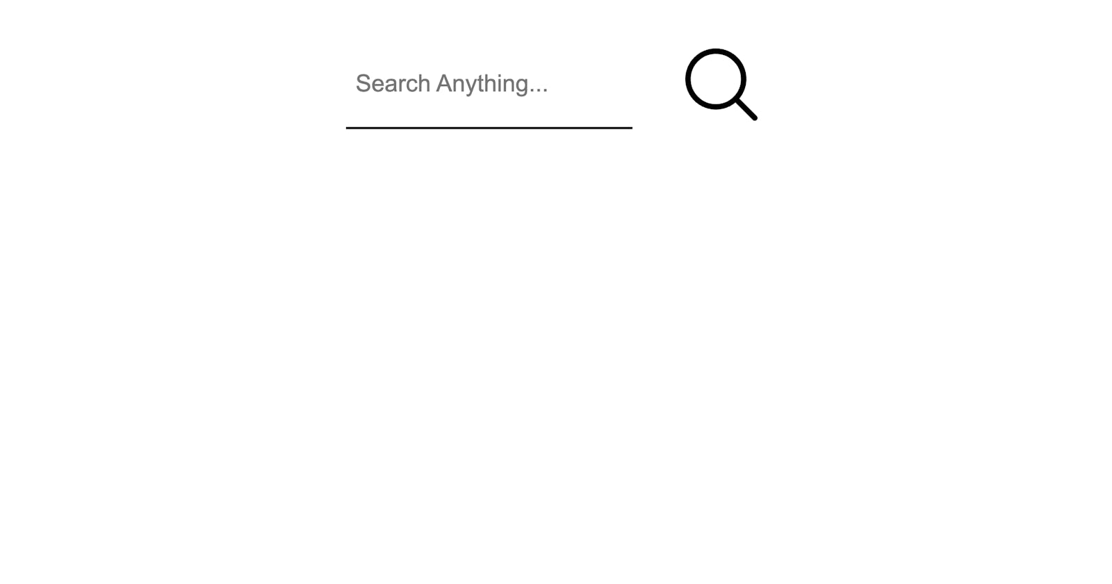
Now create an input element enclosed by a <div> element. You can make the placeholder whatever you want it to be, but make sure to set the type to text .
    <div>
        <input type="text" placeholder="Search Anything...">
    </div>
SVG File
We also need a search icon for our search bar. For this i am using an SVG file from heroicons.com as it is very easy to copy the icon from their library. Just go to their site, search "search" and hover over the magnifying glass icon, then click on "Copy as SVG". Now that you've copied it, paste the icon inside the <div> element.
Make sure to paste it after the <input> as shown below.
 <div>
        <input type="text" placeholder="Search Anything...">
        <svg xmlns="http://www.w3.org/2000/svg" fill="none" viewBox="0 0 24 24" stroke-width="1.5" stroke="currentColor"
            class="w-6 h-6">
            <path stroke-linecap="round" stroke-linejoin="round"
                d="m21 21-5.197-5.197m0 0A7.5 7.5 0 1 0 5.196 5.196a7.5 7.5 0 0 0 10.607 10.607Z" />
        </svg>
    </div>
CSS
Now that we've layed out all our HTML, we need to start creating the CSS for this project.
First we need to reset everything and then style our input element.
*{
    margin: 0;
    padding: 0;
}
Now we need to make our input element fancy by slapping on some animations and making there only be on border at the bottom.
input {
    padding: 1rem 1rem;
    font-size: 30px;
    width: 30%;
    border-top: 0px;
    border-left: 0px;
    border-right: 0px;
    border-bottom: 3px solid black;
    transition: all 300ms ease-in-out;

}
Now we need the input box to transition when it is clicked on, this means we need the :focus selector.
input:focus {
    border-bottom: 3px solid rgb(0, 158, 66);
    outline: none;
    width: 65%;
}
After this we need to make the SVG a certain size as right now it covers up half of the screen.
svg {
    width: 10%;
    margin-left: 5%;
}
Finally we need to add a finishing touch by centering the element on the screen.
div {
    display: flex;
    margin-left: auto;
    margin-right: auto;
    justify-content: center;
    margin-top: 50px;
    width: 80%;
}
Here's all the code in one piece if you had a hard time hanging on to the snippets I gave you:
HTML:
<!DOCTYPE html>
<html lang="en">

<head>
    <meta charset="UTF-8">
    <meta http-equiv="X-UA-Compatible" content="IE=edge">
    <meta name="viewport" content="width=device-width, initial-scale=1.0">
    <title>Animated search bar demo</title>
    <link rel="stylesheet" href="indes.css">
</head>

<body>
    <div>
        <input type="text" placeholder="Search Anything...">
        <svg xmlns="http://www.w3.org/2000/svg" fill="none" viewBox="0 0 24 24" stroke-width="1.5" stroke="currentColor"
            class="w-6 h-6">
            <path stroke-linecap="round" stroke-linejoin="round"
                d="m21 21-5.197-5.197m0 0A7.5 7.5 0 1 0 5.196 5.196a7.5 7.5 0 0 0 10.607 10.607Z" />
        </svg>
    </div>
</body>

</html>
CSS:
*{
    margin: 0;
    padding: 0;
}
input {
    padding: 1rem 1rem;
    font-size: 30px;
    width: 30%;
    border-top: 0px;
    border-left: 0px;
    border-right: 0px;
    border-bottom: 3px solid black;
    transition: all 300ms ease-in-out;

}
input:focus {
    border-bottom: 3px solid rgb(0, 158, 66);
    outline: none;
    width: 65%;
}
svg {
    width: 10%;
    margin-left: 5%;
}
div {
    display: flex;
    margin-left: auto;
    margin-right: auto;
    justify-content: center;
    margin-top: 50px;
    width: 80%;
}
Outro
So here you have it, a nicely animated search bar with a great expansion animation, feel free to use this in your own projects, I would love this project to actually gain some functionality, so thanks in advance.